Some things never change. And I mean never. One of those things is design’s obsession with the sacred Golden Ratio. Simply put, The ratio dictates 1:1.61. For those of us who are a little less mathematically inclined (including myself), this is the physical incarnation of The Golden Ratio:

The above is an example of what occurs when The Golden Ratio is divided multiple times, beginning with the 1:1 square on the left. The pretty spiral travels through each square to assure of us of its accuracy. The top right square is the 1 to the larger left square’s 1.61.
But what physical designs do we know look like this? None that are practical, at least.
The Golden Ratio Through History

This is the Parthenon, Ancient Greece’s triumphant dedication to the gods. With The Golden Ratio drawn in, we can recognise the domination of the largest two squares, emphasising the left side of the building and stopping at the peak of the columns where the 1:1.61 continues to divide by itself.
Human Proportions

Leonardo’s famous Vitruvian Man studied the proportions of man himself. The clearest example of the equation at work is the length from the Man’s feet to his navel, and from his navel to the crown of his head, creating the near-perfect 1:1.61 Ratio. Leonardo continued to use The Golden Ratio consciously or otherwise in a number of other works.
Modern Architecture
As I mentioned at the beginning, The Golden Ratio has followed design across culture and across time. From the Greeks to the Indians; from antiquity to modernity.
Classical architecture thrives on angles and proportions, often looking to the ancient past for inspiration. The revival of the stark architectural style was an answer to the growing Gothic design trend of the late Medieval period that often rejected balance and fortitude in favour of the grotesque. Jutting and odd features dominated Gothic architecture, lacking the appeal of the Golden Ratio.

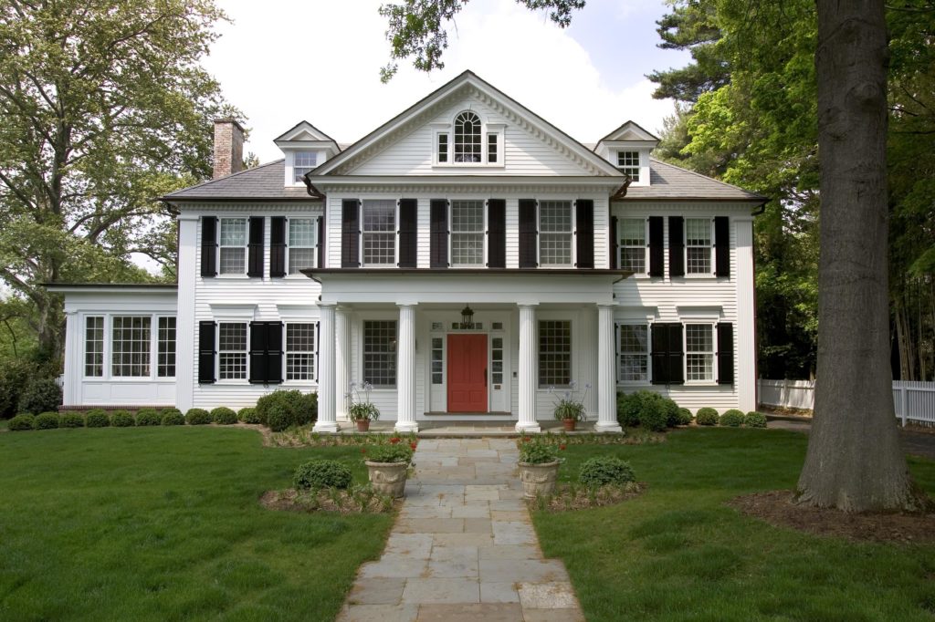
The ‘Historic Princeton’ utilises classical architectural style by promoting The Golden Ratio’s use. Even the use of columns, similar to those seen at the Parthenon, are commonplace in classical architecture. Early American homes built in Southern states such as Georgia and Mississippi incorporate the themes of structure and stability that the ratio affords. Many of these homes will emphasise the middle portion of the home that includes main living rooms and kitchens, before having offshoots of smaller sections to include bedrooms and the like.
Photography
Budding photographers are encouraged to use the ‘rule of thirds’: a design tactic that visually separates two-thirds of the respective image. However, as we have seen, it is considered more visually appealing to the eye if the image is presented using the ratio. Though numerically similar, note the differences below.
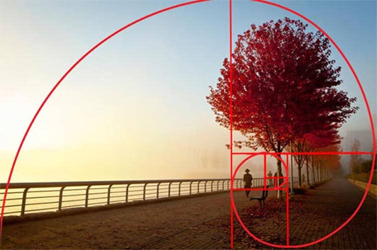

The Golden Ratio may be more complex, but as a photographer’s skills evolve, so too does their understanding of space in their images. The Golden Ratio’s mathematical equates to perfect balance – an essential tool in the photographer’s arsenal.
Pick up our top photography tips to keep killing every shot you take as well.
The Golden Section Chair

Transferring his understanding of photography in to to furniture design, James Wilkins has used his eye for balance in the creation of this unique piece. The Golden Section Chair’s armrests (and, as an extension, its legs) are obvious uses of The Golden Ratio. Placed in the right home, the Chair can pay homage to The Golden Ratio found throughout the building.
Branding
It’s a common myth that fast-food brands such as McDonalds and KFC use the colour red to short-wire our brains, and convince us that we are hungry. For the evolved human brain:
- Red = hungry.
- Hungry = buy food.
However, it’s not just food brands that are bypassing our mental barriers. Apple, Twitter, and Pepsi all use The Golden Ratio in the design of their brands.
- The Golden Ratio = visual equation for balance and perfection.
- Apple, Twitter, and Pepsi = avatars for balance and perfection.
Here is an interesting visual representation of these brands’ pursuit of perfection, courtesy of Behance:

Twitter and Apple’s logo use is sufficiently complex. But through this visual we can understand the beginnings of Pepsi’s logo. The outer circle in the initial sketch is approximately 1.61 times larger than the inner circle – The Golden Ratio alive and well in the capitalist world.
Design excellence has been the mark of successful civilisations for millennia. The above examples are proof of that. The Golden Ratio is the visual and mathematical embodiment of perfection. Therefore, to master The Golden Ratio is to master balance and perfection itself in all facets of design.
By Jay Bowden