
This year, 32 countries will attempt to make their mark on the global stage as they take part in the quadrennial edition of the world’s most-watched sporting event. Before any of the teams can even hope to win the 2022 FIFA World Cup, however, national pride first takes form in their kit.
Our ranking of each team’s 2022 FIFA World Cup kit takes a few things into account. While the aesthetics and creativity of the jerseys were the main considerations, points have been awarded and deducted based on how well they manage to capture the essence of the country’s culture and history within the sport.
This list has also taken partial notice of the competition between the “Big Three” that exists under the surface here with Nike, Adidas, and Puma having supplied the kit for all but six of the teams in the 2022 FIFA World Cup.
RELATED: Everything You Need To Know About The 2022 FIFA World Cup
In this list, you’ll find home kits pictured on the left, away kits pictured on the right and – in the two instances where applicable – third kits featured in the middle. All rankings were completely fair and unbiased. Because unlike FIFA itself, bribes were not involved in the ranking of each country. Similar to FIFA, however, human rights transgressions were overlooked.
Let’s get into it.
Ranking Every Country’s Home & Away Kit For The 2022 FIFA World Cup
1. Japan
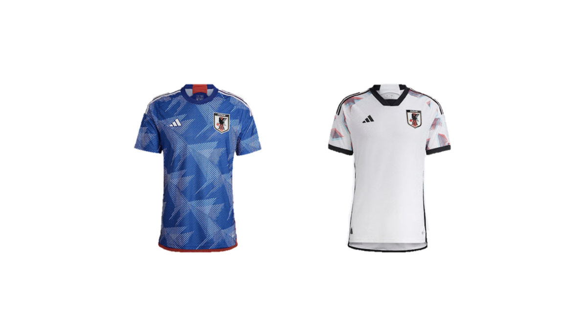
These are seriously hot. The origami and anime inspirations are tasteful and cool. The home kit has a really vibrant blue and the away kit showcase an impressive contrast between the graphics and the base colour of the jersey. A pair of instant classics.
2. Mexico
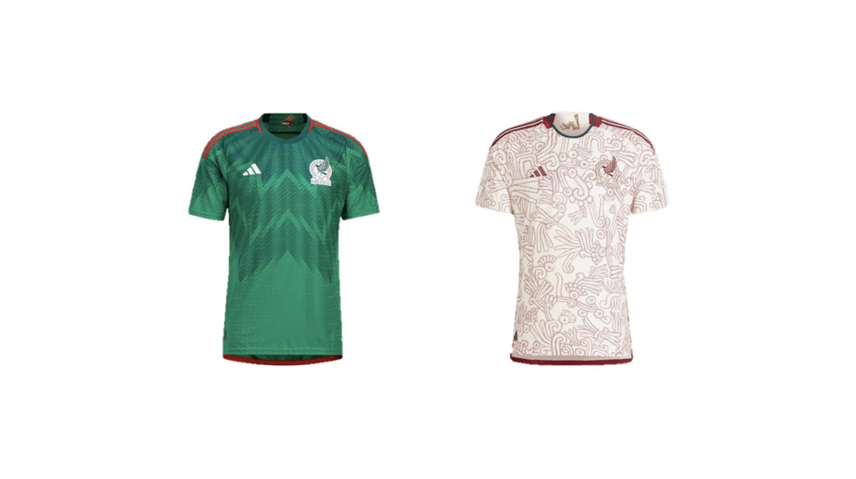
“El Tri” fans should be over the moon with their country’s uniforms. Just look at those away kits… The Aztec-inspired design might just be the best on the entire list.
3. France
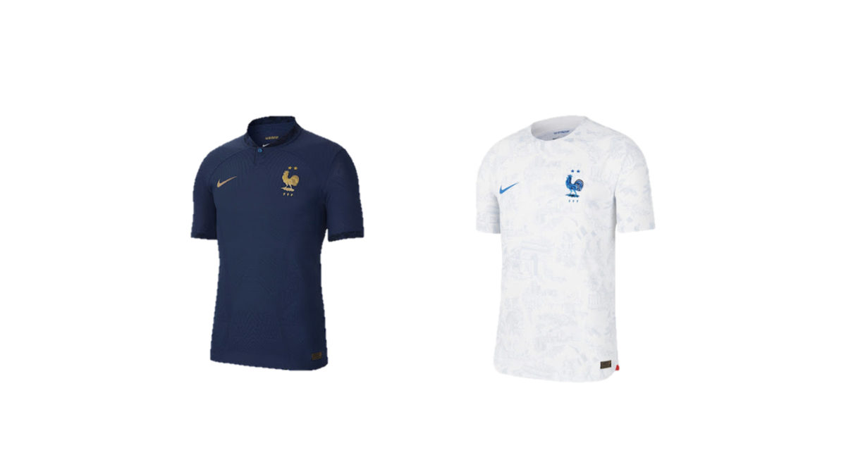
These two receive a resounding “oui” from us. There is a real elegance in their simplicity. While we are hopeful that the defending champions never get to wear these out of the group stage after facing a devastating loss to our very own Socceroos, these uniforms are truly a thing of beauty.
4. Qatar
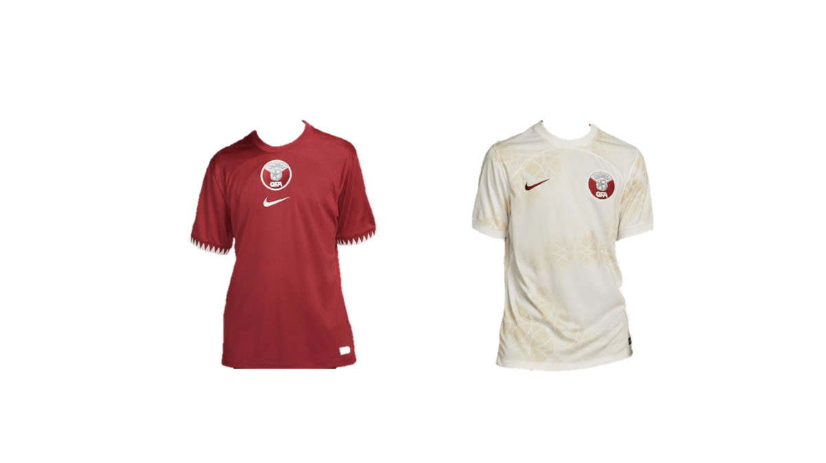
The placement of the host country fourth on this list is sure to be controversial. It’s understated, sure, but that isn’t to its detriment. The white serrated trim on the sleeve cuffs of the maroon home kit evokes the Qatar flag, with the team and the Nike logo centred on the chest.
The away kit is where it really gets interesting. The swirling sandy-coloured geometric pattern is said to represent sandstorms and pearl divers. The maroon Nike and Qatar Football Association logos are bold and complement the shirts nicely. As far as Qatar jerseys should look, this is pretty bang on. It’s not for everyone, but these should look great on the pitch.
5. Germany
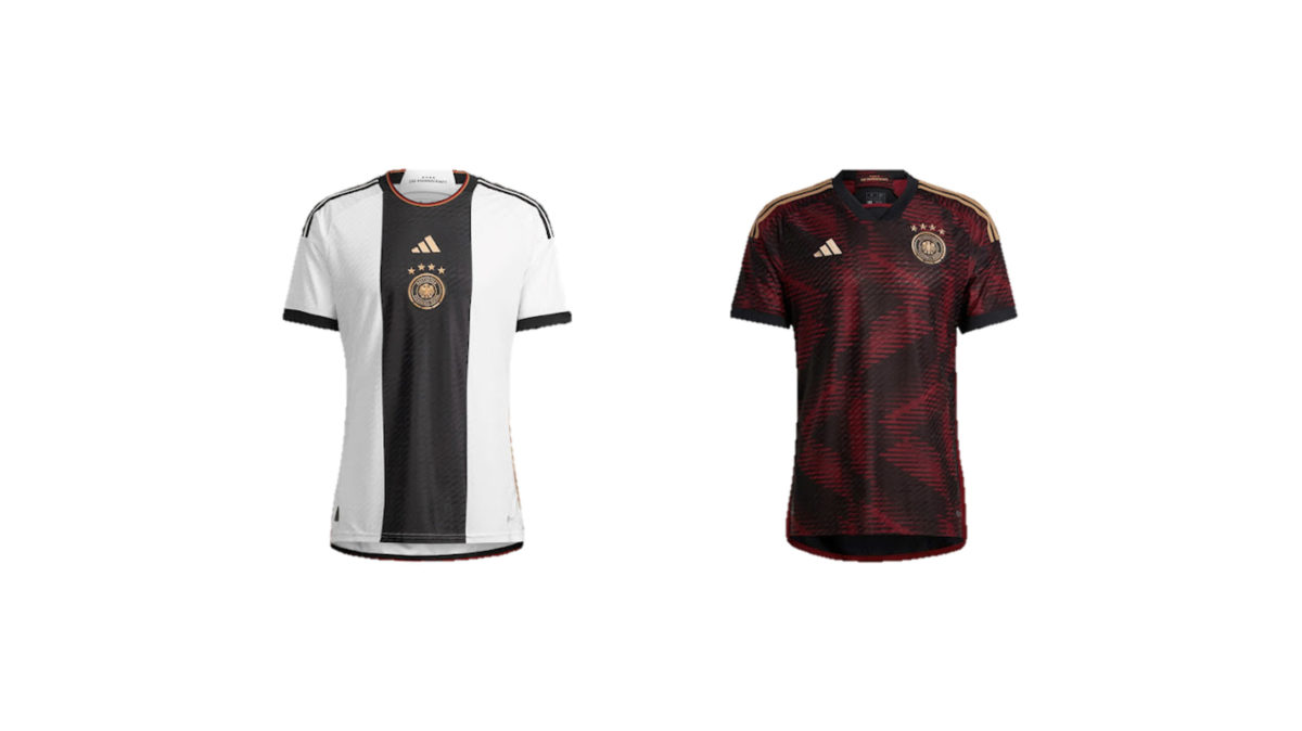
Germany home kits rarely ever disappoint. The black centre stripe down the front of Germany’s traditional white home strip was an interesting choice and, while this does look a bit Ben 10-esque, the German flag colours on the collar and the gold Adidas and DFB logos centred on the stripe really save this one.
The away kit is the better design, though. The dark red pattern throughout the top is an allusion to the DFB logo and the standard badge placement over the heart is pretty sweet too.
6. Spain
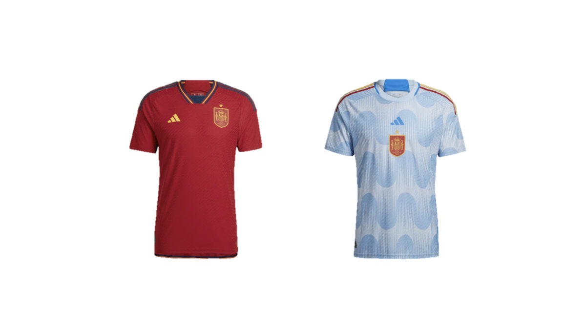
Safe to say Spain got the memo here: keep it simple on the home kit, get a little ambitious with the away.
An understated red shirt with navy and gold trim, accentuated by an all-gold gold badge and Adidas logo. Hard to go wrong there.
The away kit is unlike anything else in the tournament. The badge in the centre really pops against the light blue wavy design down the body of the shirt. The red and gold Adidas stripes on the shoulders are a fun addition too.
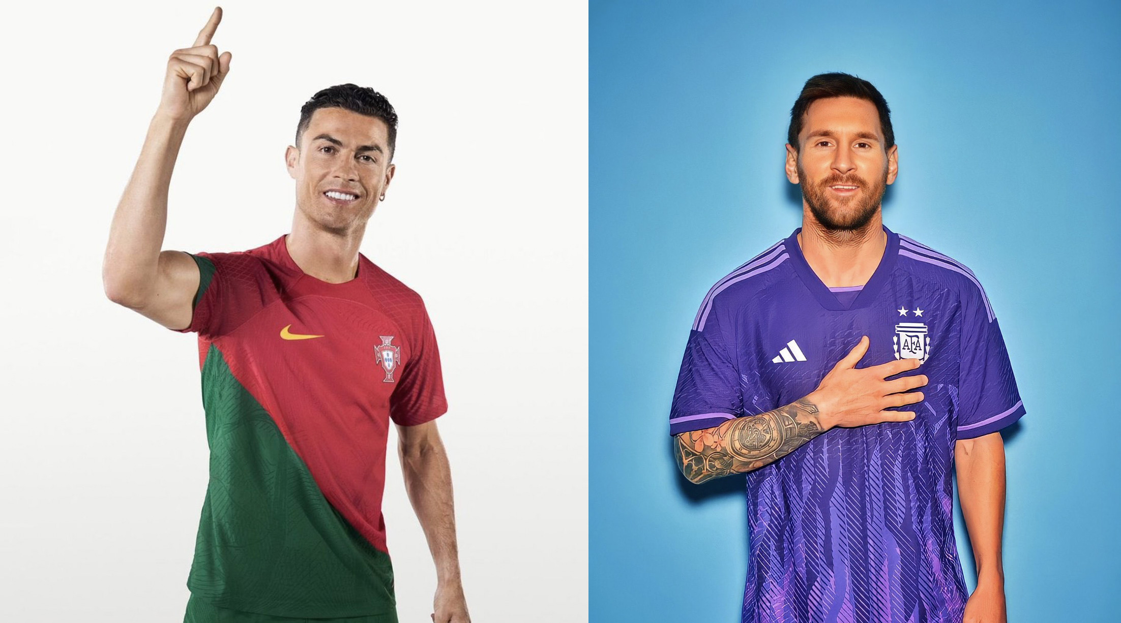
7. Argentina
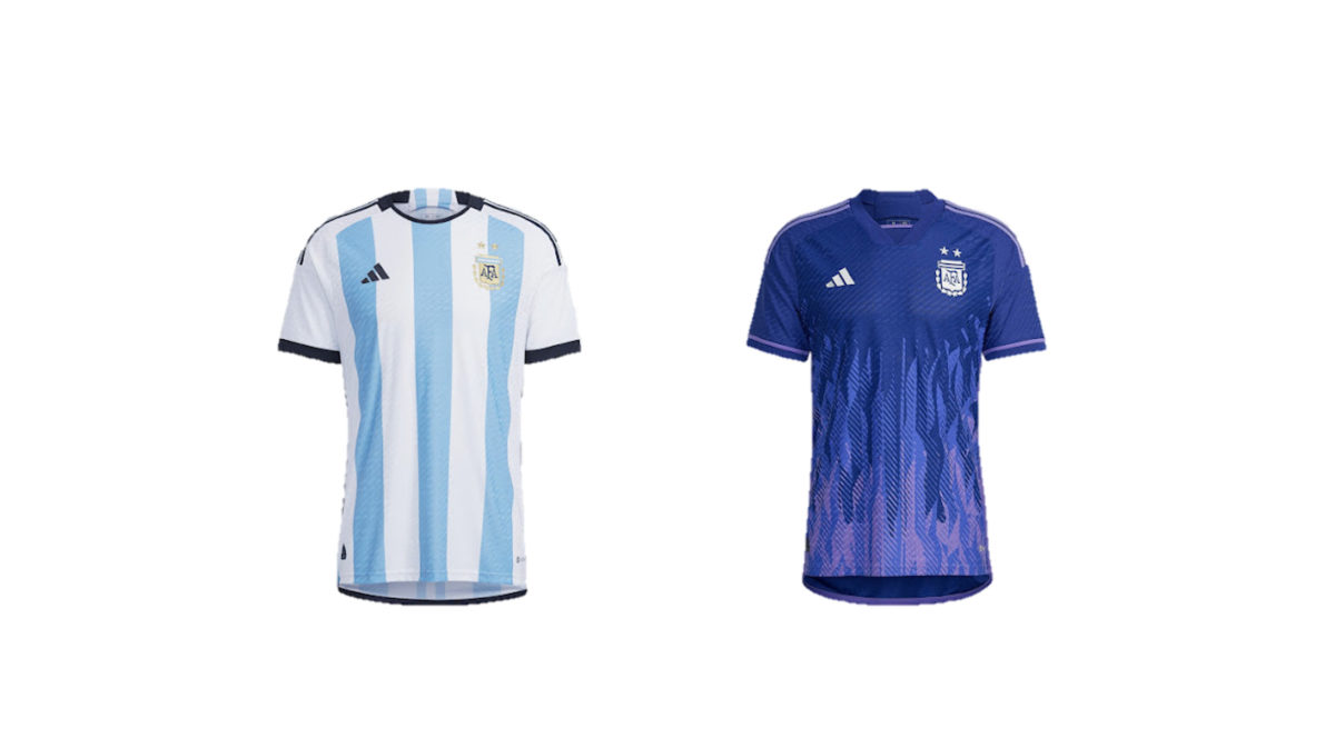
In what might be Messi’s last outing at a FIFA World Cup, it’s somewhat comforting that Argentina didn’t try and reinvent the wheel with their classic blue and white home kits. There is something to be said about how cool that new purple away kit is, though.
8. Poland
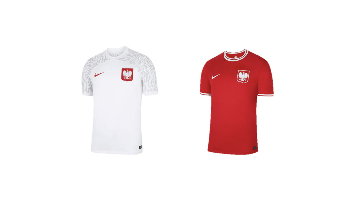
These aren’t setting the world on fire, but they are a classy set. Not entirely sold on the jagged tonal pattern on the sleeves of the home kit, although I’m really digging the retro feel of the away top. Plain red shirt with basic sleeve cuffs and collar striping. Sometimes, it really is that simple.
9. Brazil
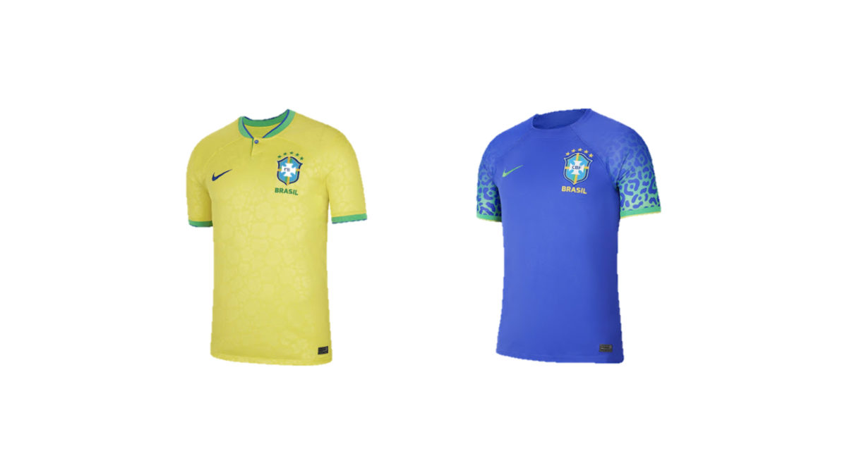
If you close your eyes and imagine a Brazil kit. It probably looks quite a lot like what you see on the left. However, the team’s canary yellow home kit does slightly divert from the formula with some subtle changes. The henley collar cleverly reveals a secret Brazilian flag inside, with the globe of the national banner actually serving as its button.
The home kit also has a jaguar spot pattern across the body of the jersey. This pattern is obviously more noticeable on the sleeves of the away kit. Some people will try and tell you these look stupid. They’re stupid.
10. Portugal
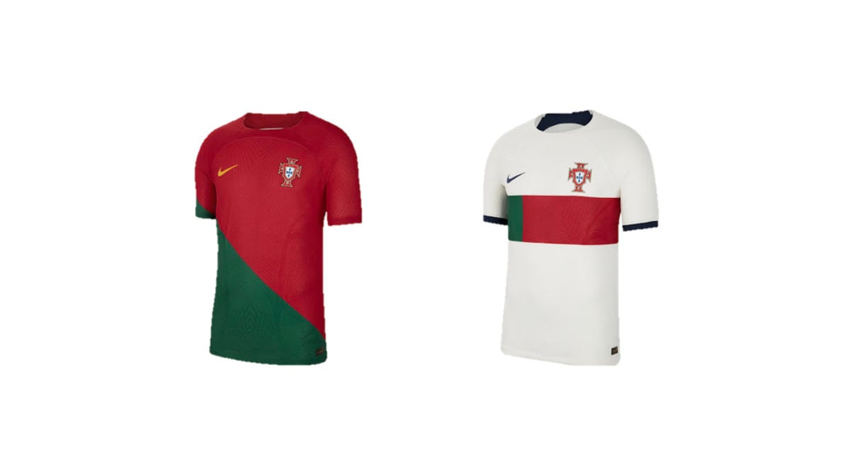
The home kits got more hate than they deserved. The diagonal flag is weird but the bold colours still work in their favour here. Can’t imagine how anyone could dislike the away top, though. The national flag’s ratio of green and red is nicely represented with a horizontal chest stripe and the black sleeve cuffs + Nike swoosh also look good against the primarily white kit.
In any event, CR7 is just happy to be playing in a uniform that isn’t Man United’s.
11. Australia
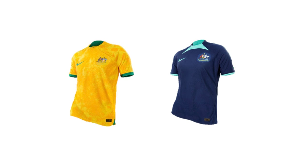
According to Nike, “The design nods to the iconic Golden Wattle flower and the traditional colours of the national side, using colours of ‘University Gold’ and ‘Tour Yellow’ to capture the adventurous nature of Australians and the physical beauty of the land.”
“The green shorts use the colour ‘Green Noise’ with a clear connection to nature, conjuring the rugged, sandy landscape of the outback and the rich wetlands and forests. The kit is completed with iconic white socks.”
As far as away kits go, the Socceroos have turned in some absolute stinkers in the past. Whether it be the teal and gold of the last effort, the random diagonal yellow line across the dark green on the one before that, or the dark navy with gold touches on the one before that… in other words, this one didn’t really have much to live up to.
Personally, Nike’s “Obsidian and Green Glow” used to represent Australia’s marine and coastal life was an original idea that, for the most part, works well. The real offender here isn’t the colour scheme, it’s Nike away kit template.
12. Ghana
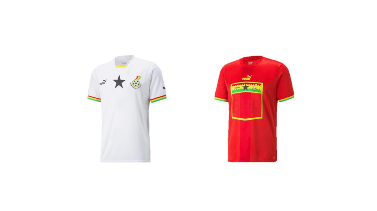
Ghana’s nickname is “The Black Stars” and their 2022 home shirt won’t let you forget it. The national flag colours are on the sleeve cuff making for a fairly clean top, but it does seem like a bit of a missed opportunity to not have given the collar the same pattern as the very similar Senegal shirt does.
The reason why Ghana is ranked #12 above Senegal is simple. As you’ll find throughout this list, Puma has applied this unusual shield template for the player’s number that absolutely ruins all of their away kits. This is one of the more bearable instances of that design choice, largely because the bright colours really save it.
That jagged green-yellow-red flag stripe would’ve looked great across the chest on its own. Oh well.
13. Croatia
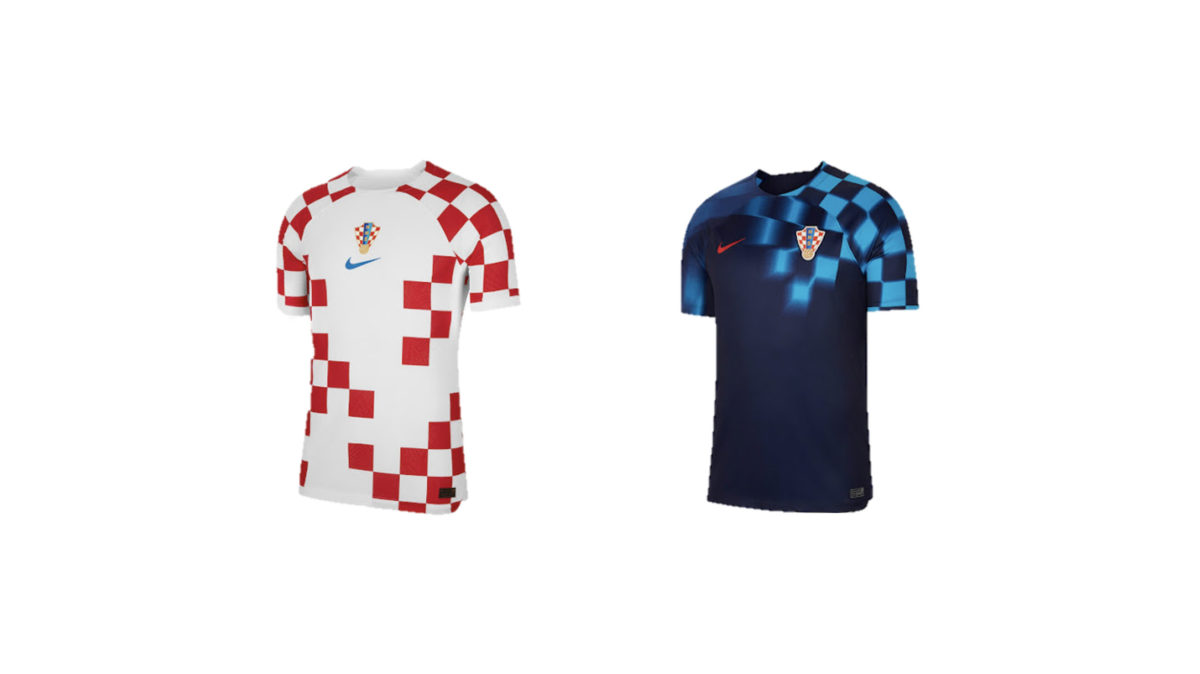
Many have accused Nike of butchering a classic when it comes to this interpretation of the iconic checkers. That’s probably a bit of an exaggeration.
While the design of the home kit includes uneven areas of white, it’s still unmistakeably Croatia. The centred badge and blue Nike swoosh are on full display here and the overall design feels quite balanced.
The away design has opted for an extreme dosage of the motion blur for the light blue checkers on the dark blue base. It’s definitely bold, but the creativity is honestly pretty refreshing.
14. Wales
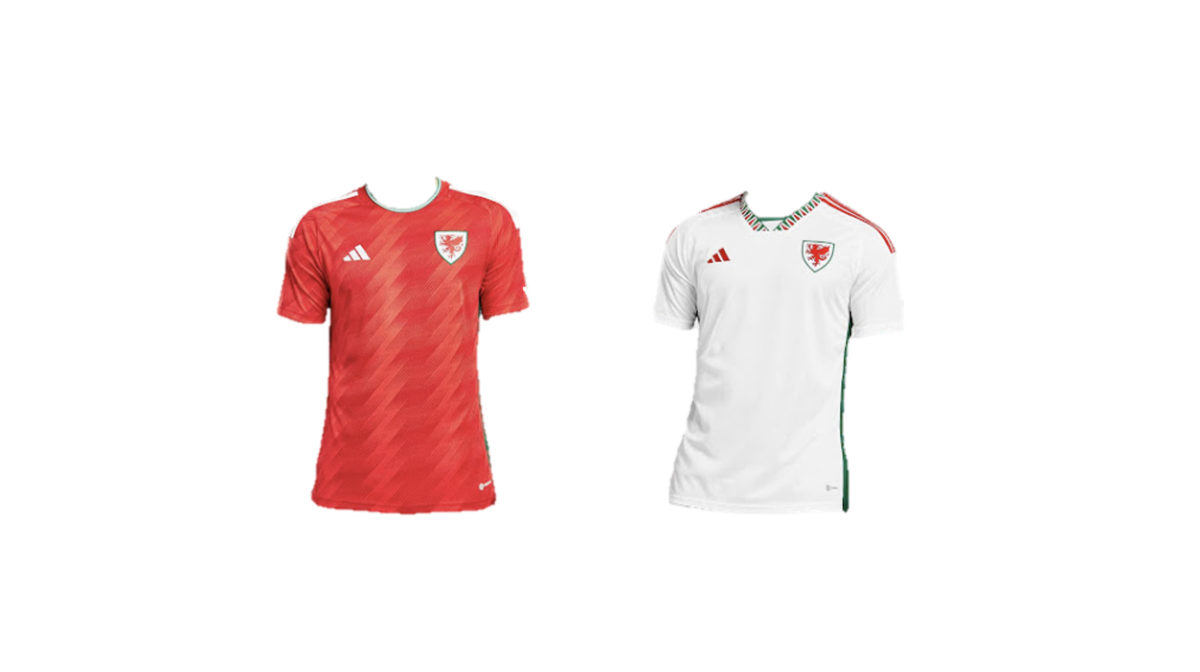
It’s their first foray back into the World Cup since 1958 and they really came to play. The zigging and zagging of the red home top, complete with a green and white trim on the collar, is a sharp look for the Welsh out there.
The unique collar pattern of the away kit seriously rips. With red and green detailing throughout, the iconic dragon crest is able to shine on the primarily white top.
15. Ecuador
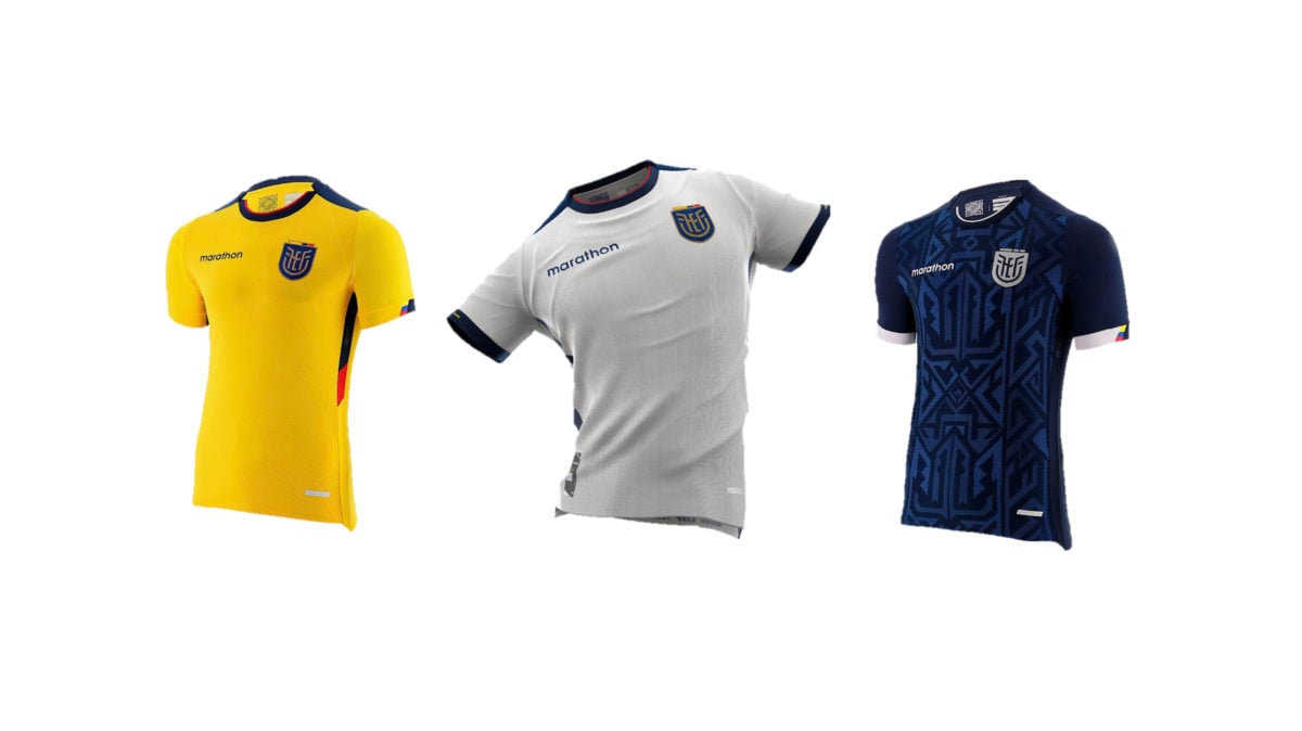
The home and third kits are a little bit basic but are a decently clean look for the Federación Ecuatoriana de Fútbol from Marathon nonetheless. While the home kit features the colours of the flag, the navy blue away kit is the real winner here. It features a geometric pattern presumably inspired by the ancient Incan people that once inhabited the area and the white accents on the uniform look sharp.
16. England
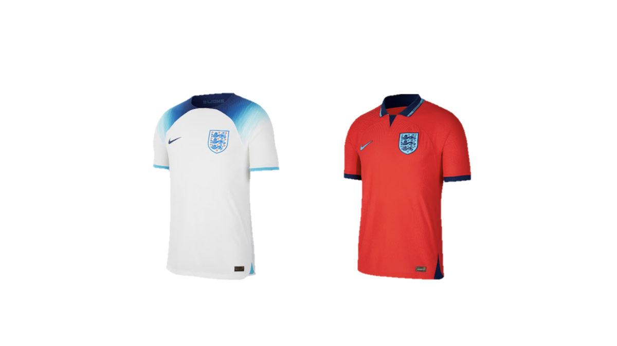
England’s placement in the exact middle of the pile is a different story from the fairly inoffensive entries that surround it. Here, we have a tale of two kits. Their away offering? Cannot say enough nice things about it. The look features the iconic “Challenge Red” of the Three Lions, with the collar and knitted graphic only adding to this fresh take on a classic.
On the other hand, if one were to walk past that England home kit in a store – similar to the nation’s hopes at the World Cup itself – it isn’t coming home.
17. Uruguay
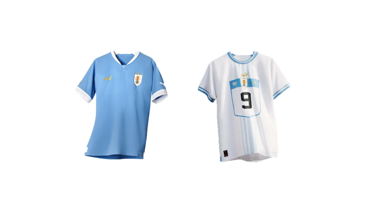
The home kits really save the day for La Celeste here. It’s classic. The signature blue with white sleeve cuffs and a single button v-neck collar. If it ain’t broke, don’t fix it.
That away kit has so much promise but Puma’s giant number shield is a dealbreaker. At the top of the frame, there is this “Uraguay” watermark in the font of a baseball jersey that looks ridiculous and out of place here.
18. Senegal
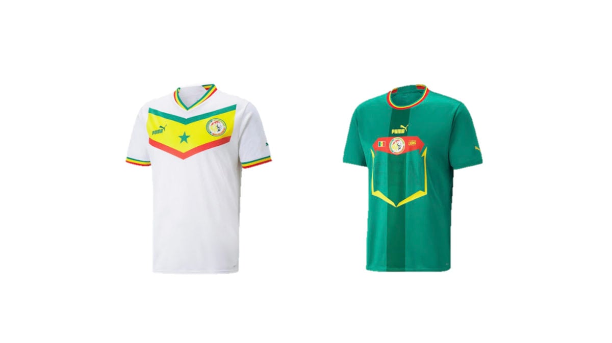
Puma stated that the 2022 home kit is a tribute to the Senegal side that made the quarterfinals of the FIFA World Cup in the country’s first appearance in the tournament back in 2002. A touching sentiment, but unfortunately complete lies. This is what the 2002 Senegal home kit looked like, for reference. There is genuinely nothing similar about them at all.
It’s a nice shirt, regardless. The large, centred star from the national flag – similar to Ghana’s kit – looks nice against the bold chevron on the chest. Someone really ought to be fired for the Puma-fication of that away kit though… Look at how they massacred my boy.
19. Iran
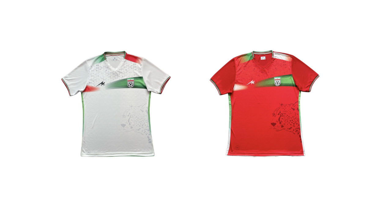
These aren’t bad. Inverting the colour scheme and calling it an away kit might’ve been the standard for previous years, but the 2022 FIFA World Cup has simply raised the bar in that regard.
20. Serbia
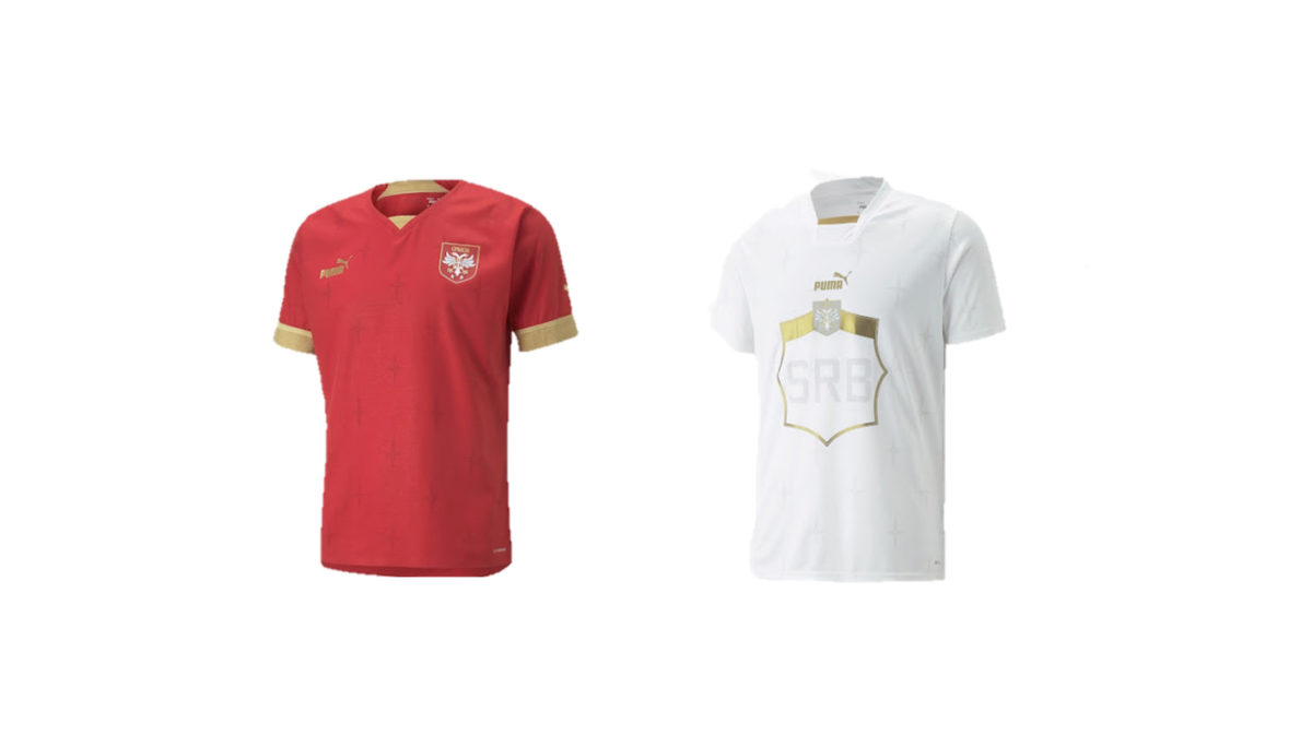
It’s pretty bloody hard to mess up red, white, and gold. The home tops also display Serbia’s new national team crest, which looks crispy. It is really unfortunate that it is joined by another feral Puma away kit.
21. The Netherlands
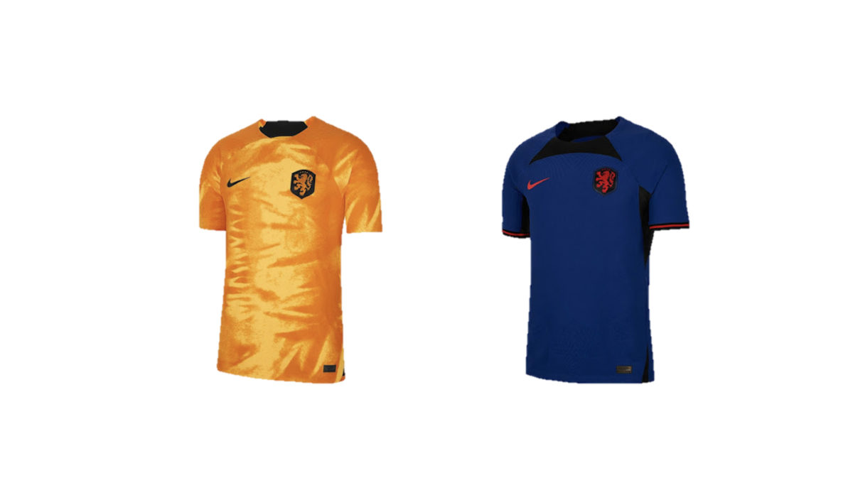
The bizarre velvety texture on the home kit seems to betray the classic “Oranje Pride” associated with the country. The away entry is improved by an interesting colour palette but ultimately has the exact opposite problem, playing it far too safe. Nike’s template makes it look more like a training top.
22. Costa Rica
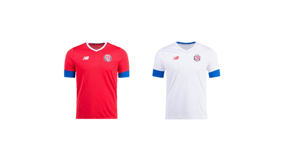
New Balance hasn’t given us much to talk about here. They’re fine, I guess.
23. Morocco
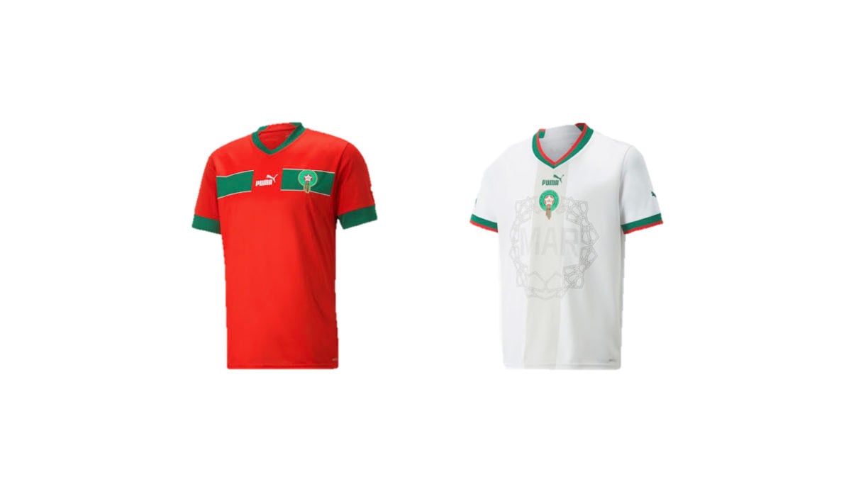
A rare instance of Puma’s home kit being worse than their putrid away kits. Here, the away kit “frame” is inspired by Arabic art and circles the player’s number in a faint tonal grey. The red and green trim on the sleeves and collar goes well here.
The home kit is an inferior interpretation of their 1998 design, which was also made by Puma. The green stripe has been simplified and does not continue onto the sleeves this time around. The original polo shirt has also been replaced with a v-neck collar. These changes have done nothing except make the shirt worse.
24. Saudi Arabia
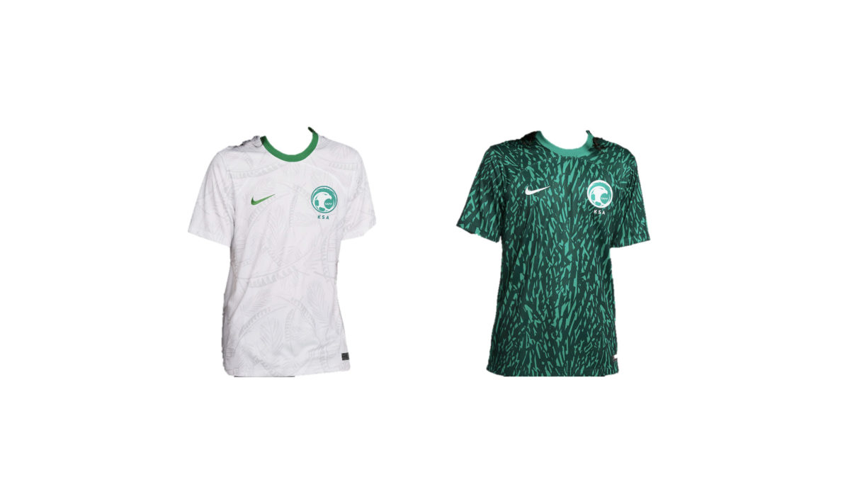
Saudi Arabia has recycled the tonal feather-palm front print from their 2020 design for the home kit. Was it really that good that you couldn’t have gone with something new? Especially next to that yucky away kit.
25. Belgium
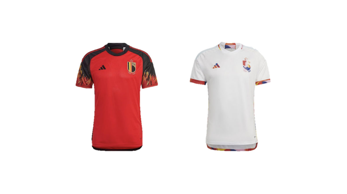
Are these from Belgium or Guy Fieri’s “Flavortown”? While the fiery patterns on the sleeves might look a little ridiculous out on the pitch, they’re going to go down a treat at any midweek bowling league.
26. The United States of America
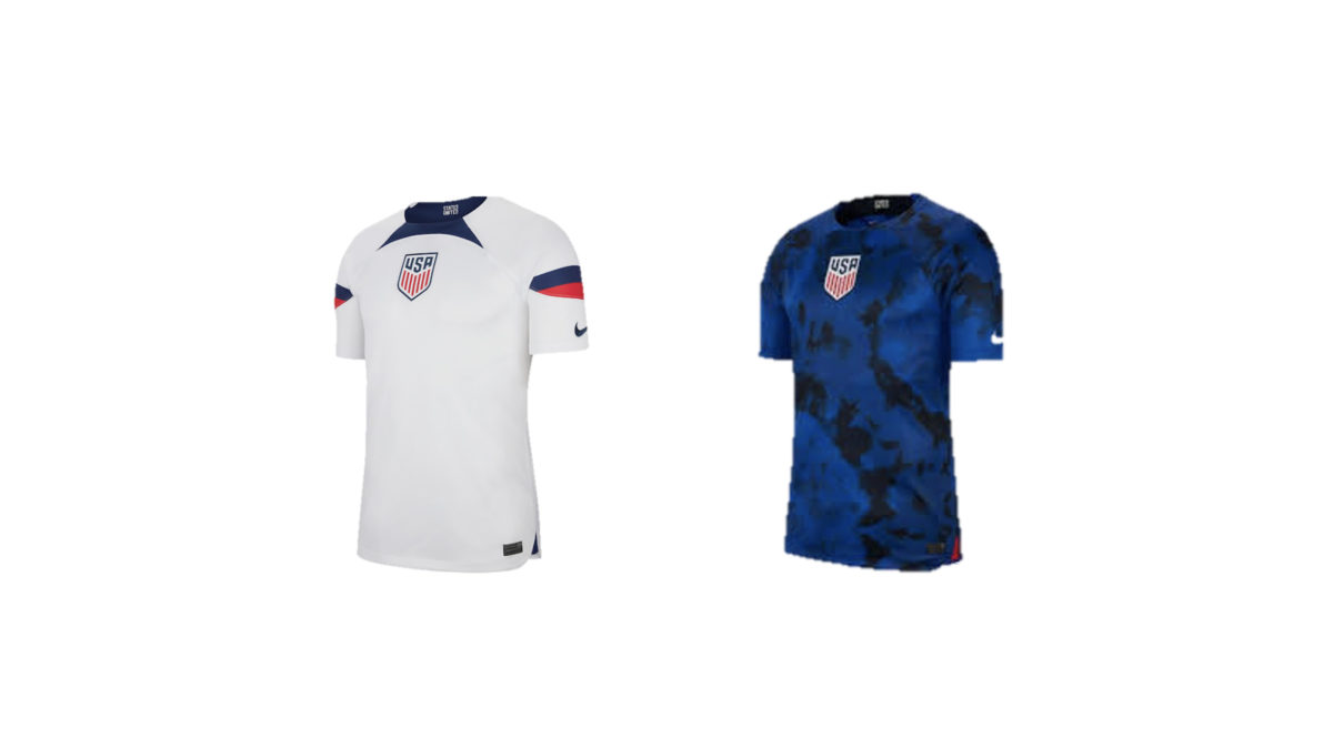
About as boring as you’d expect.
27. South Korea
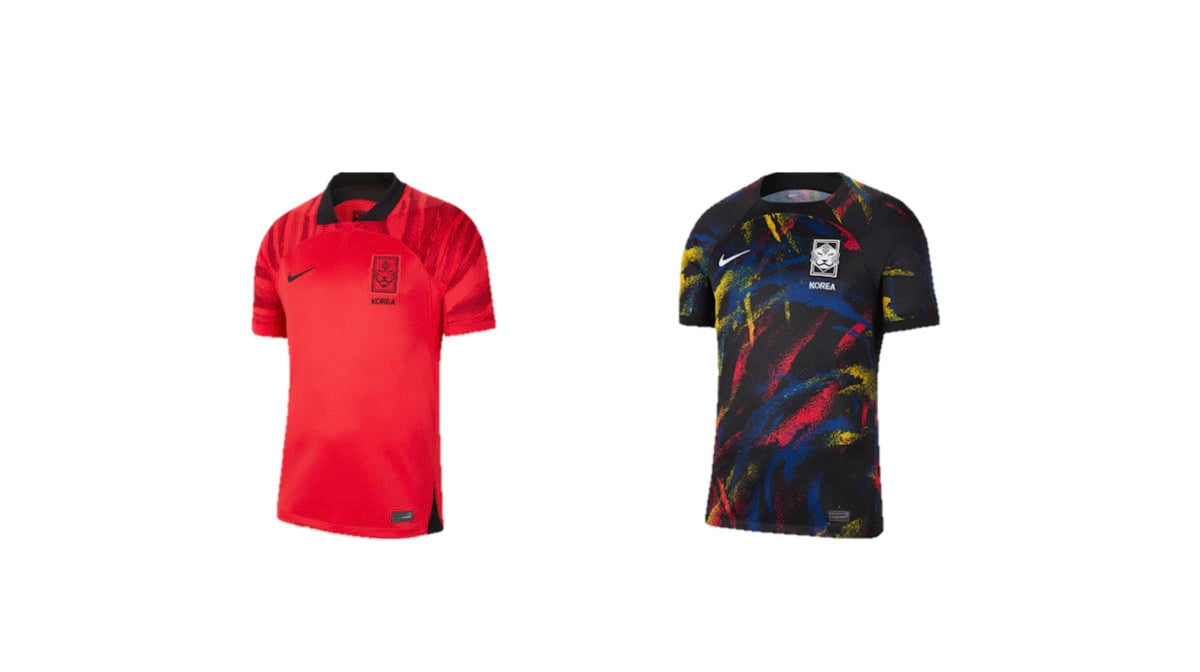
Both of them are a little overdesigned and overbearing.
28. Tunisia
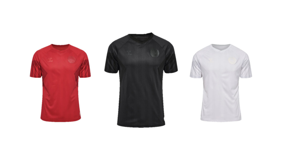
This team has given us three kits for the 2022 World Cup and not a single one of them is worth a second look. From a distance, would you even be able to tell what country they represent? No, you couldn’t. For starters, these aren’t even Tunisia kits. They’re Denmark’s.
Cameroon and Tunisia were the only countries that haven’t officially released/had their kits leaked, hence their lack of inclusion on this list. While the lines on the kits score some points as a homage to Denmark’s most famous footballing triumph in the 1992 European Championship, manufacturer Hummel has removed all character from the iconic Dansk Boldspil-Union (DBU) and given them some plain T-Shirts.
29. Canada
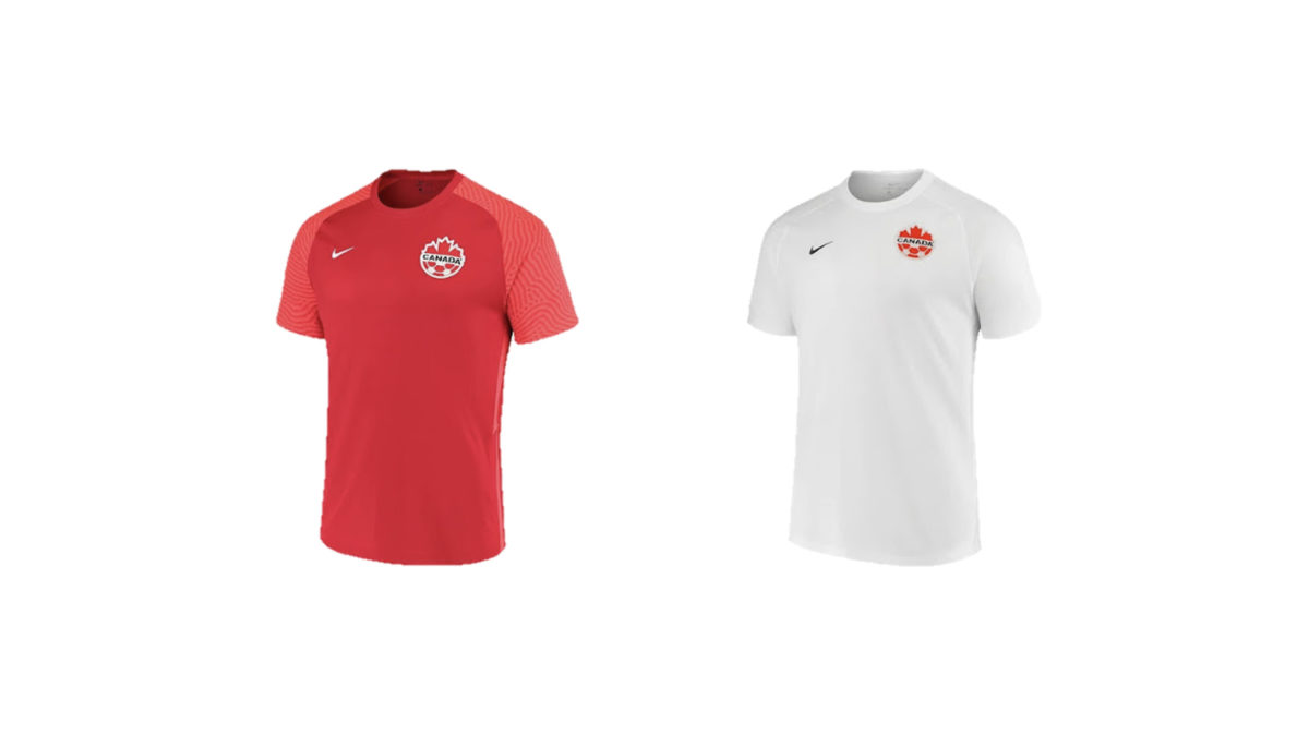
Oh, Canada… What the hell were you thinking?
30. Switzerland
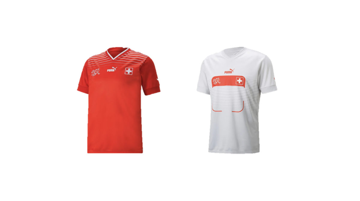
Rounding off our list here, we have by far the worst offender of Puma’s away kits. That just looks like a giant QR code on the chest.