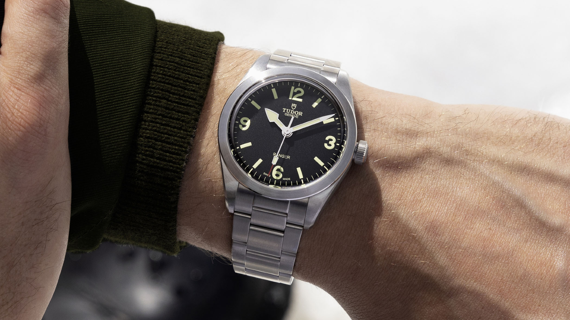

Just like its big sibling in Rolex, Tudor is a watchmaker that has played an important part in the history of boundary-pushing human adventure. Within this legacy, Tudor has just released a new timepiece to celebrate the 70th anniversary of the British North Greenland Expedition, in the 2022 version of the Tudor Ranger.
However, watch enthusiast opinion is somewhat divided over the new Tudor ranger, thanks to a few parts of its design you just can’t unsee once you see them. Is It too boring? Is the dial badly spaced with fonts and numerals that would raise the eyebrow of any graphic designer? That’s definitely some of the sentiment out there.
Let’s start by saying the design of the new Tudor Ranger hasn’t appeared out of thin air, with this 3, 6, 9 dial design dating back to the ’60s, which in turn is a descendent of the Rolex Explorer dial that first saw the light of day in 1953. However, even before the Rolex Explorer was born, Tudor had equipped 26 members of the British North Greenland Expedition (BNGE) with Tudor Oyster-Prince watches. These timepieces accompanied the explorers for two years as they conducted scientific research on the top of the world, which is the anniversary Tudor is celebrating this year with the relaunched Ranger.

RELATED: The Tudor Black Bay Pro Will Make You Want To Travel Internationally
One of the first examples of the Tudor Ranger that bears any similarity with the version released last week, is the 1967 Tudor Oyster Prince Ranger 7995/0. With a black dial, luminous 3, 6, 9 dial layout and spade-shaped hour hand, it was a good-looking watch with a 34mm steel case.
Fast forward to 2014 and Tudor rereleased the design in the Heritage Ranger ref. 79910, which measured a gargantuan 41mm in diameter, was powered by an ETA 2824 movement and arrived on a bund strap. It was a heavy-handed effort, without much refinement and wasn’t quite successful in translating the proportions of the dial into the bigger case size.
Unfortunately, the pervading feeling about the new Tudor Ranger is that it suffers from many of the same problems. I had canvased some opinions on Instagram over the weekend to see if I was the only one who thought it wasn’t quite right, and the overwhelming response was summed up by one commenter in, “Meh.”

Aside from being boring in many people’s eyes, common thoughts on the Ranger were around its case still being too big at 39mm, and the layout of the dial being awkward, specifically the numerals, font and spacing. Sure, these are small parts of a bigger puzzle, but no puzzle with a missing piece is going to leave you happy.
The general sentiment about the Tudor Ranger from the watch community was one of an opportunity missed, with many blaming it for being unadventurous, while others wondered what typography expert Jonathan Hoefler would say about the dial. I came across one particularly articulate comment on the Hodinkee article on the Ranger, by a trained industrial designer named Matt. His issues were as follows:
1. The hole in the middle of the 6: You’d expect that to be either a circle, or a flattened circle (aka ellipse). But this one looks more like a rugby ball/football. As we humans tend to like “logical” shapes, built from simpler forms, this feels unnatural to the eye.
2. The upper part of the 6: Just doesn’t look like it’s flowing from the bottom shape. A Panerai 6 for example has a beautiful spiral shape to it. Like it’d been drawn in one smooth swoop. This one feels more like someone cut up a bunch of paper numbers and then glued the bottom part of one 6 to the upper part of a slightly different style 6.
The other numbers are also full of jarring non-smoothness – making them feel aesthetically awkward. For a counter-example, look at the numerals on a Longines Spirit or Patek Aquanaut, they feel much more natural, logical, more smooth.

Not content with describing the issues with the font, Matt when further and actually mocked up a couple of alternative designs that solved the issues he had with the dial, and they look pretty damn good. The middle design solves the issues with the font, while the design on the right takes it a step further towards the iconic Rolex Explorer ref. 1016 design. Shut up and take my money.
Now obviously, we understand that Tudor can’t get too close to vintage Rolex designs to be seen as cashing in on the big sibling’s history. However, when you consider how close the Tudor Black Bay Fifty-Eight is to a vintage Rolex Submariner ref. 5508 with a red arrow bezel, it’s easy to understand why the Black Bay Fifty-Eight has a waiting list and the Ranger likely won’t.

Despite the grumbles about the dial, there are a lot of great things about the new Tudor Ranger. These include the MT5402 movement with a 70-hour power reserve and the Oyster-style steel bracelet, which not only does away with the faux rivets of the Black Bay Fifty-Eight bracelet, but also has a quick-adjust system that was debuted in the incredible Black Bay Pro earlier this year (one of my favourite watches of 2022).
If you’re unphased by the dial, then the Tudor Ranger still represents great value with an RRP of $4,150 on the new steel bracelet, and even more affordable on a strap at $3,730. But it does go to show that when it comes to watch design, the devil is always in the details.