

“For over a century, watches have focused primarily on one thing, right? That’s the time,” said Stan Ng, Vice President of Product Marketing for Apple Watch, when he sat down to chat with me about the new Apple Watch Series 7 design. “Even as recently as just a decade ago, it would have been hard to imagine something on your wrist that enables so much capability.”
He’s right. No matter which angle you look at it, the Apple Watch is a pretty impressive product. In fact, it wouldn’t be a stretch to say that in 2021, it’s probably the best all-around smartwatch on the market. It’s already the best selling watch of any type, ever, selling 100 million units in less than six years, a feat which took the ubiquitous Casio G-Shock 33 years.
But with the recent launch of the Apple Watch Series 7, you can’t help but get the sense that its meteoric rate of improvement might be slowing, even if just a little. Has the wind come out of the sails already? How good is the design of the Apple Watch really?

RELATED: Apple Watch ECG Readings Now Available In Australia
RELATED: The Best Smartwatches To Buy
Origins
When the Apple Watch launched in 2015, it was an entirely new space for the tech giant. Smartwatches already existed, with the likes of Sony Ericsson, Motorola and Samsung launching products in the years earlier. While Apple was late to the game, it didn’t take long for the Apple Watch to do, “more than any other smartwatch on the market.”
In the years that followed, the Apple Watch moved at a breakneck pace, with both the Series 1 and Series 2 following the first Apple Watch less than a year and a half later. GPS functionality was added, the water resistance was improved so you could swim with it and the screen got brighter.
In Series 3 we got Bluetooth, Siri and a built-in altimeter, while Series 4 got a bigger screen and could even perform an ECG on your heart. Series 5 was the first Apple Watch to get an always-on display, while the Series 6 introduced a blood oxygen saturation sensor, a processor that was 20% faster and a better battery that could charge in around 90 minutes.
That’s a pretty remarkable rate of change in half a decade. From a smartwatch that didn’t have cellular connectivity or even a GPS, to one that can perform an ECG and even detect COVID-19 before visible symptoms. No wonder 100 million Apple Watches have been sold.

Lucky Number 7
This is where we arrive at the Apple Watch Series 7, where the headline update is that the case, screen and buttons are bigger. This might be a bit of a letdown for the most ardent of Apple Watch enthusiasts, who probably expected it to do MRI brain scans, boast a pair of opposable thumbs and offer a practical path to world peace.
But while the Series 7 might not have the same number of new features as previous generations, the updates that were made offer maximum impact to the user experience. And while it might be counterintuitive, slowing down also states a case for just how good the Apple Watch already is.
“Designing something for the wrist has these really unique constraints,” said Ng. “It’s a physically small product and it has to be small to fit on your wrist. It limits the amount of information that can be shown, so every single pixel counts. There cannot be any wasted space.”

This spatial economy is something that the design teams at Apple have taken very seriously with the new Series 7. The case size has increased by just 1mm, but the designers have managed to add a whopping 20% of extra screen real estate. The main way they’ve achieved this is by slimming the bezel of the watch that frames the screen, now just 1.7mm thick.
“How do you maximize the screen area without significantly growing the overall case size?” asked Ng. “It required us to completely re-engineer the display, the front crystal and the internal enclosures all together, so that we could reduce the borders from what we had on Series 6, down to just 1.7mm on Series 7.”
“We also wanted to make sure that the thickness of the watch stayed the same. We were able to do that by integrating the touch sensor into the OLED panel as well, which was a technological innovation for us.”
“The display is so important. Its size, its capabilities, its brightness. What it does has this profound and direct impact on the user experience, and it has an impact almost a hundred per cent of the time when people are wearing their watch.”

Less, But Better
If you’re getting the sense that the new screen on the Apple Watch Series 7 is a big deal, that’s because it is. To improve the display, the entire case had to be redesigned, now with softer curves at the edges, and a seamless join between the case and the crystal covering the display. The edges of the display were also redesigned to have a unique refractive edge that makes the screen appear to subtly wrap around the curve of the case.
Alan Dye, Apple’s Vice President of Human Interface Design, who was also present with Ng explained “we knew this is an opportunity for us to optimize the design of the entire system. So we went about reconsidering and recrafting every element, making hundreds of small, but really important and impactful changes to make the new UI work in harmony with that new display.”
“We start with the simplest developments, which are really the most critical. And in this case, we started by redesigning all of the controls,” said Dye. Not only were the buttons completely revisited to be optimised for the new display, but so were all of the fonts, which were redesigned to have five different sizes to make the watch easier to read than in the past. With this additional real estate to work with, the design teams also created a full QWERTY keyboard, another first for the Apple Watch.
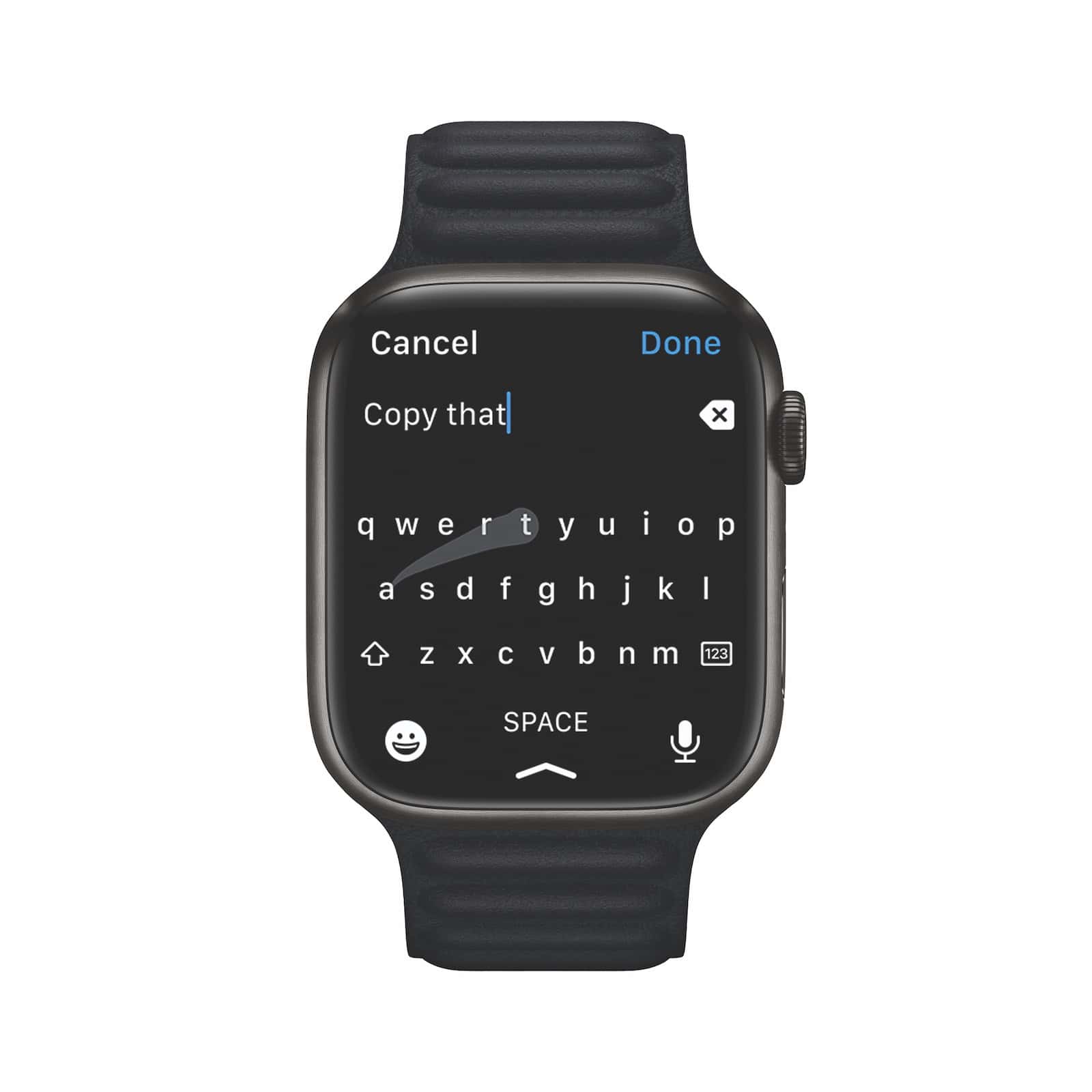
“From the very beginning of Apple Watch, we very much wanted a QWERTY style keyboard, but we’ve always felt the experience was very constrained by the screen size. This year with the new display, we have the opportunity to deliver this feature in an incredibly usable and powerful way.
“We spend a great deal of time designing this new keyboard, one small detail that you might find interesting is we removed the bezels, the outlines from each individual character or from the keys to help the whole thing, feel a little bit less cramped and hopefully in a subtle way, imply that precision isn’t critical with the taps,” Dye said.
How does the keyboard work if you don’t need to be accurate with your taps? Apple has developed their own swipe typing system for the Apple Watch, where you simply drag your finger from one letter to the next, taking your finger off the display when the word is finished. Sure, you wouldn’t want to write the next War and Peace on your Apple Watch, but you’d easily be able to make brunch plans for the weekend.
Of course, these sorts of changes aren’t going to grab the same sorts of headlines as the introduction of an ECG reader, or a blood oxygen saturation sensor. But they are still critical changes, which make the experience of owning an Apple Watch all the better for them.

They’re the types of slower, iterative, design changes that can only really happen when a product is already successful. Because once something is already successful, the designers are able to focus on the smaller improvements that are less about what the product actually does and more about how well the product does it. Once you’ve nailed the function, you can turn your attention to the form, and even more importantly, the feeling.
“I think this is the sort of work we love to do,” Dye said after explaining how his teams went about redesigning the buttons of the new Apple Watch. “I think making work that’s different, sometimes it’s easy, but actually taking something that’s already working really well and refining it to make it even better? That’s something we really enjoy in the design team.”
In the journey of any type of progress, there will always be diminishing returns. Because the better something gets, the less change or improvement that naturally happens. As is the cruel reality of someone at an elite level runner, an amateur might be able to drop their 5km running PB from 30mins to 20mins in a year, while an Olympic athlete might only improve by a few seconds over the same time.
The Apple Watch Series 6 might be described as the “absolute best device you can get if you own an iPhone,” but the Series 7 offers all of that, plus a little bit extra. The changes might be smaller, but they’re arguably more meaningful in their day-to-day impact as Apple really starts to dig into the detail of what a well-designed smartwatch should be.
Because like any piece of design that finds itself on the trajectory of becoming an icon, each iteration finds progress in more and more granular details. “When we think about design, we think about design as so much more than our product looks,” Dye offered, “But most importantly, how it works.”


